Sunday, December 19, 2010

Food Review @ Vansh, Starhill Gallery

Being a person who loves to eat and never gets fat, I would better be of as a food blogger rather than a lifestyle blogger. I'd literally eat anything which is served on the table, given the fact that it is plated properly and also it must be somewhat edible.

I've never done food reviews before and me being a person to eat everything, would that make me a a good person to do food reviews or is it the opposite?


I was invited to Vansh in Starhill Gallery. Vansh is a restaurant where they served Indian cuisine. It has been awhile since I've last eaten authentic Indian food. The only memory I have of having Indian food was when I was very little. Yes, it was that long!

The closest-somehow-related food to Indian cuisine I'm having now, would be the mamak food I have every now and then.


What makes food taste a little bit better would be the ambiance of the place you are dining in. When you walk into Vansh you can see that it has a beautifully designed exterior 'wall'. Inside, the place is lit up with warm coloured lighthing which I think somehow compliments the food served there. 


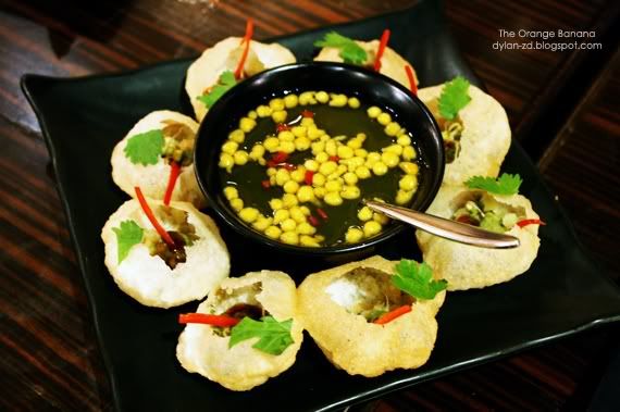
Papadums served as snacks

As I took my seat, a glass with four equally rolled crackers was served on the table. A very unique way of serving us Papadum. It came together with 3 different types of dipping sauce, where I like to call it the 'traffic light sauce' which would be chilli, raita and mint.

The crisp cracker has a peppery flavour which makes it slightly spicy if that is what you want to call it. Definitely a change from the regular papadums I've eaten. As for the sauces, it did not make any difference for me as the peppery sensation slightly overpowers the sauce's flavours.  


Manggo Lassi - RM17

I was looking forward to a chilled drink, so when a glass of Manggo Lassi was put on the table, I was like YES! Something refreshing. The cherry even made it looks better; such nice a nice contrast.

Lassi is a yogurt based drink which is blended together with milk and water. This particular one I'm having would have some mango pulp blended together too.

On my first sip, it was already a let down for me as it was not chilled. How can a yogurt-fruit drink not be chilled? Furthermore, I did not taste any mango inside. The drink is a bit too 'foamy' for me.

Just maybe if it was chilled, it would be much better.


Bombay Pani Puri - RM20

This is actually crunchy semolina puffs served with chilled spice water and sweet tamarind chutney. The dish looked appealing with the many colours on the plate, however, it did not please my taste buds.

The semolina puffs are bite size and with a big mouth (literally) like me, I'd gobble one straight down. It did not have much taste to me. It was like munching down air. The chilled spiced water didn't help much. Am I too picky on food?


Tandoori Lamb Chop - RM50

I'm a meat person and this is what I've been looking out for. Marinated with spiced yogurt and then roasted in the tandoor would best give it the authentic Indian cuisine taste.

And believe me, this dish was not a let down. Perfectly roasted with the juices still remain in the meat. Best to eat this with your fingers as it'll go to places where forks and knives have never been to! I would prefer having a larger piece, though it's already considered a huge piece for some.


Butter, Garlic, Plain Naan - RM10/basket

Naans are one of the most basic Indian food. It is an oven-baked flatbread. Having naans served, brought back memories when I last dined at a Indian cuisine restaurant.

Vansh's naans taste slightly milder. I still remember the raisin naan I had when I was small. I was looking forward to that same experience when I first taste naan but I could get that from Vansh. The naan's flavours are a little too mild for me.


Vegetarian Kebab Platter - RM30
Chef's exquisite kebab sampler featuring aloo mutter tikki, tandoori mushroom and tandoori paneer tikka

Oh no! Not another vegetarian dish? Haha! But then again, I kind of liked this dish because of its flavours it has and also because of its juicy-ness. I would have this as a side dish.


Chilli Cheese Kulzza - RM20
Fresh fluffy bread packed with mild yellow cheddar, piquant chilli and fresh coriander.

And then we're having pizza next. You can taste the cheese here, unlike the flavours in the naans. There's nothing much to be excited of over this dish. It's just another bread dish. Probably, it would be a better choice to order if you are planning on ordering naans.


vansh"/

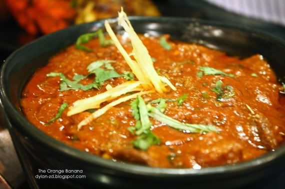
Kashmiri Rogan Josh - RM36
Lamb cubes simmered in a fennel scented yogurt gravy

Now this would be a dish to die for! It's lamb cubes served in a bowl of gravy. Wherever I go, lamb would be one of my top choices of food to eat. This is another lamb dish that made my day. Best served with Lamb Briyani (RM45) and that's double kill! Lamb x2! 


Lamb Vindaloo - RM38

Now you're talking! Another lamb dish! It just gets better and better. For me, you can't go wrong with any lamb dish. 


Masala Chai

It is an Indian tea which has Indian spices and herbs. The wonderful aroma filled the air as it was brought to the table. You can have it with or without sugar and milk but I just had two teaspoons of sugar in mine just so I could taste it pure.

Masala Chai is very different compared to the usual English tea you have every other day. Because of its spices used to brew this tea, it has a certain kick to it. It not exactly sweet but rather 'spicy' for me. Not really my cup of tea but for plus points, its aroma was absolutely amazing.


Khajooor Kulfi - RM18
Homemade frosty flavoured with exotic dates

Kulfi is a traditional Indian ice-cream. Unlike the usual ice-creams, this is more dense and is much more creamier. I've never had kulfi before and this was certainly my first time. I was looking forward to its taste.


Of course if it was also your first time having kulfi, the first bite will seem to take you off a bit but after a few more bite, you'll soon learn to love it. It's not too sweet and yet it taste great.

We also had a choice of Lychee Kulfi which was equally good.


If you are planning on having Indian cuisine and want to try what Vansh has to offer, I'd recommend you the lamb dishes.

Location:
Vansh
Star Hill Gallery
181, Jalan Bukit Bintang, 55100 Kuala Lumpur.

Tel :
603 - 2142 6162

Opening hours : 
Mon. - Sun : 12:00pm - 1:00am

Wednesday, December 15, 2010

My Toshiba Satellite L200 Is Dying

Is your desktop or laptop growing old? Do you feel that they are soon going to die off and go into 'hardware heaven'?

Have you experienced times where your system just reboots itself automatically without any warning? One time you are busy doing your work, the next second, the screen just goes blank and the next thing you see is the startup screen.

Have you experienced the time where you have to reboot your system a few times just to get into the Log-in screen? First time you push the ON button, it'll reboot itself a few times before actually coming into the Log-in screen.

Have you experienced the time where your system just hangs and there's nothing you can do but to push and hold onto the power button till your system shuts down and to start it up again?

Have your experienced a crashed screen, where your screen will have jagged lines something like a smashed screen but more uniformed?

I have and still am having the same problems.

My Toshiba Satellite L200 has been with me for almost three years now. We've battled through great fights with various trojans and viruses. It has survived a couple system reformats. It has been together with me for countless nights awake, accompanying me when I am up finishing my assignments.

But now, I feel like it is already too tired to be going through more tough challenges. I think its time for my companion to go to rest.

Which is why I need a new partner in crime. I'm auditioning potential candidates. Leave me your application in the comments section below. Or if there are anyone out there who thinks you are qualified enough, send yourself to my doorstep and I'll accept you straightaway.

Send yourself to: Platinum Hill Condo PV5, Jalan Melati Utama, Taman Melati Utama, 53100 Setapak.

Here's how sick my Satellite L200 is:
Or you could also help me get a brand new Toshiba Netbook by clicking LIKE on my contest entry in Toshiba Malaysia's Facebook Page.

Remember to subscribe to
 The Orange Banana and also follow me on Twitter @dylan3008.

Sunday, December 12, 2010

Blogging Tips: 2.0 Blog Headers

Hello again! I will be adding a second entry to my list of Blogging Tips. You can read all about my first entry regarding Blog Column Layouts here. However this time around, I will be talking about blog headers.

When ever you click into someone's blog, the first thing you see would be their blog headers. So by looking at the blog header, it will give you the first impression towards that person's blog. A bad header can make your reader lose interest in reading your blog, while a good header will of course boost up your blog's appearance.

What makes a good blog header? And what makes a bad blog header?

2.0 BLOG HEADER
There are various blog header designs out there. I would divide the most-used/common designs into three main categories: Rectangular Header, Over-sized Header and the Text Header.

blog header designs

2.1 RECTANGULAR HEADER
This type of header is the most commonly used header.

What normally a person would do is, they would probably make/edit their own header in a photo editing software (eg. Photoshop), upload it into a photo hosting site and then replace the HTML coding. Which in the end, you will get something like this.

blog header

If Figure A is what you get, then you are probably safe for now. This design is created with the header actually sticking to the content area. Thus, there will be no alignment problems. However, one thing bad about this type of design is that too many people are already using this design which eliminates its uniqueness.

On the flip side, if Figure B is what you get, you would probably want to reconsider on your blog header design. As you can see from the image above, a very clear rectangular shape is visible. This particular design is way passed its time. What used to be a good design back then is no longer a good design now.

First off, the rectangular shaped header looks like it's floating on air and has no docking place. The sharp and hard edges is very unpleasing to the eye and it can be quite irritating to look at.

One way to solve this problem is to blend your header with the background or content area, which will be explained more later in this blog post.

2.2 OVER-SIZED HEADER
This is yet another very popular type of header designs among bloggers. An over-sized blog header is when your blog header actually covers more than 3/4 of your screen and only leaving your content a small little space to peek through at the bottom of the screen.

blog header design

To tell you the truth, I used to have an over-sized blog header once. I thought that it was cool to have a huge picture which pops up the first thing my blog loads. I treat it as my 'welcome page'. I used this layout for quite some time until I realised that this layout isn't really practical anymore.

The first thing you should know is that users do not like to scroll. Yes, scrolling up and down with your mouse is actually bad. So, if you have a huge header such as Figure C, your reader with have to scroll down a few times to get to your content.

Even though your header looks great and you feel like showing it off to other people, people will only get impressed once and after that they would treat your header just like any other header.

Everyone is rushing for time. What readers want are your blog content and not your header. Don't waste their time having them to scroll down to get to your content.

2.3 TEXT HEADERS
Text headers can turn out to be good or bad. It all depends on how you execute it. Here are two examples of blog headers which uses text.
blog header designs

Figure D looks like the normal preset theme you get off your usual blog hosting site. It doesn't give you much freedom to edit your blog header. You just type in the words and the alignment is all done for you.

Simple but this can be deadly as it could ruin the whole design of your blog.

The header in Figure D looks unfinished, poorly executed and not planned properly. A wrong choice of font can be disastrous.

My suggestion is to get a blog template which lets you upload your own blog header image. What you need to do is to go to your own image editing software and create your own blog header using just fonts. Play around with the sizes, colours, font type and alignment. Your header does not only need to be in one single straight line.

Sometimes, if you choose the correct font type such as in Figure E, it will do all the work for you. The font looks more professional and the size and alignment is just right, giving it the 'kick'. Even though it is just text but it manages to give you that strong feeling.

2.4 BLENDING YOUR HEADER WITH THE BACKGROUND
One additional thing to take note of is, if you want your blog header to look at much better. Try blending your header with your background or your content area.
blog header designs

The aim here is to create a border-less header.

In the two examples above, both headers does not seem to have an edge. This can be achieved by using a transparent background while editing your header.

With this kind of header design, it doesn't hurt your readers eyes with sharp and pointy edges. However, it might take some time to design one of these headers to match with your blog template as some blog templates might need some further tweaking in the coding area.

Then again, do try to use this method while creating your blog header. It works for almost all blog header designs.

2.5 THE VERDICT
Get rid of rectangular floating headers. Especially those which has sharp edges.
Over-sized headers can be a bad thing, unless you know what you are doing.
Text headers can be simple but it does delivers if executed properly.
Blend your header with your background.

2.6 DOES THIS HELP YOU?
I have completed another set of blogging tips in hopes that it could help you all out just a little bit in understanding what design works and what doesn't.

There are a lot more header designs out there which I have not touched on. If you have any queries, do drop me a comment and I'll try my best to help you out.

Of course, everything here is based on my own perspective and point of view. My opinions might be different from yours.

If you think this blog post is really useful, help me Share this post on Facebook and also Tweet it on Twitter. Help me help others.

More blogging tips coming soon!

Remember to subscribe to The Orange Banana and also follow me on Twitter @dylan3008.


Blogging Tips: 1.0 Blog Column Layouts

This is a blog post which I have been wanting to do for a very long time. I don't consider myself a professional blogger and knows every single detail about blogging. I'm just here giving my own personal opinion based on what I see and also what I feel should be better.

I will be starting a 'Blogging Tips 101' category, where I blog about things which can help make your blogging experience a little bit better.

1.0 BLOG LAYOUTS
In this particular blog post, I will be blogging tips about blog layouts. These past few years ever since I've started blogging, I've came across some good blog layouts and also some really bad ones.

Now these blogs which has bad layouts does not really benefit the blogger at all. This is because a blog with a bad layout will give the readers a hard time reading through your content, thus giving them an eye sore. Worse comes to worst, they will not come back again!

1.1 COLUMNS
First of all, if you would like to create a blog or change your blog layout, the first thing you must make sure is:

How many columns do you want your blog to have?

Is it a one column blog? Two columns or three columns? It can go right up until seven or eight columns. From what I've seen, most blogs have the default 2-column layout. This is a safe layout but you will still have to organize your widgets properly.

If you are having two or more columns, you will also need to consider the positioning of each column, as there can be various positions for your columns to be placed.

I have separated the column positions into two groups, The Basic and The Advanced.
columns

columns

1.1.1 WHICH COLUMN LAYOUT TO CHOOSE? 2-COLUMN LAYOUT?
If you have just started blogging or you have no idea at all about coding and editing, I would suggest you to choose the 2-column layout.

First off, this is a safe layout to work with. It will least make your blog look messy and unorganized. Having your widgets place all in one part of the screen will make it easier for your readers to search through them.

Also remember to choose an appropriate width for your content bar (the area where your blog posts appear) and also your sidebar. Too much white space in your sidebar and your widgets will look like they are floating on air and if the width is too small, some widgets will not be able to fit into it.

1.1.2  3-COLUMN LAYOUT
As for this layout, it will be a tight crop for all of your content. Two sidebars on either side of your screen will take up quite some space in your content area. Thus, you will have a tight crop of your content area and your uploaded photos need to be resized smaller.

I would not say that this is a bad layout. Just that it needs some clever tweeks and a bloggers own creativity and you'll do fine with this layout.

Do take note of the columns' width. It can be very TIGHT.

1.1.3  4-COLUMN LAYOUT
If you are thinking of using the 4-column (Left or Right sidebars) layout. My advice is, Don't!

This layout is just too messy for a blog. You're widgets will look unorganized with the different column widths.

As for the 4-column (Lowerbars). This can be a good layout for the advanced users but do look up for one which has a left or right sidebar as well (which will make it a 5-column layout). This way, you can place all our important widgets on the side and place your not so important widgets on the bottom. Readers will get access to your important widgets (chatbox, ads, etc.) easily without having the trouble to go through all the unnecessary widgets (tags, labels, random links, button, badges, etc.)

1.1.4 MENU BAR
Sometimes, you will come across blog layouts which have menu bars. These are very useful instead as it is usually located at the top of a page, just below your header.

This menu bar gives easy and fast access to your readers to get to other important pages such as your About and Contact page.

1.2 THE VERDICT
If you have just started blogging or have no idea on how to organize a multi-column blog, get a 2-column blog layout, preferably with a menu bar.

If you have been blogging for quite some time already and you know your way around the coding, get a 2-column blog + lower bars + menu bar.

1.3 DOES THIS HELP YOU?
I hope with what I have blogged here, will help you decide on which is the better layout to use for your blog. Of course, what I have given is just a brief explanation on each column layout pros and cons. There are more to be said but I'll just leave it as it is.

If you have any questions concerning this topic, you can leave me a comment below and I'll be sure to help and assist you the best I could.

Help me share this blog post on Facebook and also by Tweeting it, so that it could help other bloggers out there too! =)

Until next time, happy blogging!

Remember to subscribe to The Orange Banana and also follow me on Twitter @dylan3008.

Wednesday, December 8, 2010

My Selangor Story 2010 Winners!

The moment is finally here! If you have been following the stories of My Selangor Story, I'm sure you'll be anxious too to know who the winners are.

Earlier today (yesterday in fact, since it's past midnight), the results of MSS was finally announced! Where?
A small ceremony was held at DELIcious, Marc Residents.

mss results

Here are the winners of the My Selangor Story 2010 Bloggers Competition!

mss results

mss results

mss results

mss results

mss results

mss results

mss results

Also not forgetting KK from kokd.blogspot.com who won the Best Video Category. He couldn't be with us as he was abroad in the UK.

List of winners:
Dania Ryezel - Grand Prize
Tian Chad - 1st Runner Up
Thristhan - 2nd Runner Up
MsXeroz - Most Creative Blog
Eyriqazz - Most Interactive Blog 
Dylan - Best write-up
KK - Best Video
Feeq - Best Photos

So there you have it, the 8 winners for My Selangor Story 2010! But of course all of us are winners as we'd won the chance to gain new friendships and also go through the whole experience together.

Thank you My Selangor Story and to everyone who had been involved in the event one way or another, from the organizers, crew members and especially the sponsors. Thank you for the great experience! Hope to see you all once again when MSS 2011 comes.

Before ending this post, just in case you did not notice, YES! I won the BEST WRITE-UP category! Scroll back up to take a look at my handsome face.

Now I can proudly say that, I can do good write-ups. Anyone wants me to do reviews or articles? =D

Here are my 6 days posts during the whole MSS trip:

MSS, you rock my socks off!
tiramisu
Remember to subscribe to The Orange Banana and also follow me on Twitter @dylan3008.


Saturday, December 4, 2010

2D Animation - Music Video (Frank Sinatra's Strangers in the Night)

This will be a short update though I have not updated my blog properly for the past week. This post, I will be showing you one of my other college assignment.

Subject: 2D Animation

We were to choose any music available and make a music video for it, in animation. We chose the song 'Strangers in the Night by Frank Sinatra'.


Constructive Criticism is appreciated.

Remember to subscribe to The Orange Banana and also follow me on Twitter @dylan3008.