This is a blog post which I have been wanting to do for a very long time. I don't consider myself a professional blogger and knows every single detail about blogging. I'm just here giving my own personal opinion based on what I see and also what I feel should be better.
I will be starting a 'Blogging Tips 101' category, where I blog about things which can help make your blogging experience a little bit better.
1.0 BLOG LAYOUTS
In this particular blog post, I will be blogging tips about blog layouts. These past few years ever since I've started blogging, I've came across some good blog layouts and also some really bad ones.
Now these blogs which has bad layouts does not really benefit the blogger at all. This is because a blog with a bad layout will give the readers a hard time reading through your content, thus giving them an eye sore. Worse comes to worst, they will not come back again!
1.1 COLUMNS
First of all, if you would like to create a blog or change your blog layout, the first thing you must make sure is:
How many columns do you want your blog to have?
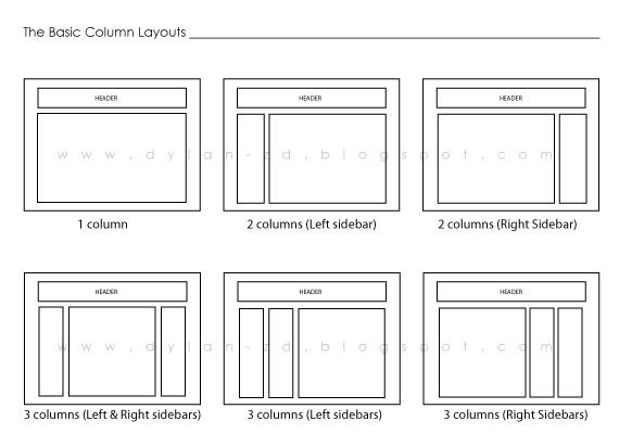
Is it a one column blog? Two columns or three columns? It can go right up until seven or eight columns. From what I've seen, most blogs have the default 2-column layout. This is a safe layout but you will still have to organize your widgets properly.
If you are having two or more columns, you will also need to consider the positioning of each column, as there can be various positions for your columns to be placed.
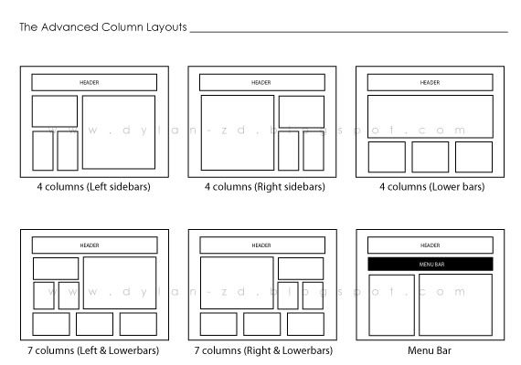
I have separated the column positions into two groups, The Basic and The Advanced.


1.1.1 WHICH COLUMN LAYOUT TO CHOOSE? 2-COLUMN LAYOUT?
If you have just started blogging or you have no idea at all about coding and editing, I would suggest you to choose the 2-column layout.
First off, this is a safe layout to work with. It will least make your blog look messy and unorganized. Having your widgets place all in one part of the screen will make it easier for your readers to search through them.
Also remember to choose an appropriate width for your content bar (the area where your blog posts appear) and also your sidebar. Too much white space in your sidebar and your widgets will look like they are floating on air and if the width is too small, some widgets will not be able to fit into it.
1.1.2 3-COLUMN LAYOUT
As for this layout, it will be a tight crop for all of your content. Two sidebars on either side of your screen will take up quite some space in your content area. Thus, you will have a tight crop of your content area and your uploaded photos need to be resized smaller.
I would not say that this is a bad layout. Just that it needs some clever tweeks and a bloggers own creativity and you'll do fine with this layout.
Do take note of the columns' width. It can be very TIGHT.
1.1.3 4-COLUMN LAYOUT
If you are thinking of using the 4-column (Left or Right sidebars) layout. My advice is, Don't!
This layout is just too messy for a blog. You're widgets will look unorganized with the different column widths.
As for the 4-column (Lowerbars). This can be a good layout for the advanced users but do look up for one which has a left or right sidebar as well (which will make it a 5-column layout). This way, you can place all our important widgets on the side and place your not so important widgets on the bottom. Readers will get access to your important widgets (chatbox, ads, etc.) easily without having the trouble to go through all the unnecessary widgets (tags, labels, random links, button, badges, etc.)
1.1.4 MENU BAR
Sometimes, you will come across blog layouts which have menu bars. These are very useful instead as it is usually located at the top of a page, just below your header.
This menu bar gives easy and fast access to your readers to get to other important pages such as your About and Contact page.
1.2 THE VERDICT
If you have just started blogging or have no idea on how to organize a multi-column blog, get a 2-column blog layout, preferably with a menu bar.
If you have been blogging for quite some time already and you know your way around the coding, get a 2-column blog + lower bars + menu bar.
1.3 DOES THIS HELP YOU?
I hope with what I have blogged here, will help you decide on which is the better layout to use for your blog. Of course, what I have given is just a brief explanation on each column layout pros and cons. There are more to be said but I'll just leave it as it is.
If you have any questions concerning this topic, you can leave me a comment below and I'll be sure to help and assist you the best I could.
Help me share this blog post on Facebook and also by Tweeting it, so that it could help other bloggers out there too! =)
Until next time, happy blogging!