When ever you click into someone's blog, the first thing you see would be their blog headers. So by looking at the blog header, it will give you the first impression towards that person's blog. A bad header can make your reader lose interest in reading your blog, while a good header will of course boost up your blog's appearance.
What makes a good blog header? And what makes a bad blog header?
2.0 BLOG HEADER
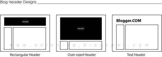
There are various blog header designs out there. I would divide the most-used/common designs into three main categories: Rectangular Header, Over-sized Header and the Text Header.

2.1 RECTANGULAR HEADER
This type of header is the most commonly used header.
What normally a person would do is, they would probably make/edit their own header in a photo editing software (eg. Photoshop), upload it into a photo hosting site and then replace the HTML coding. Which in the end, you will get something like this.

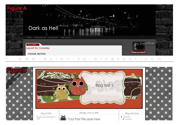
If Figure A is what you get, then you are probably safe for now. This design is created with the header actually sticking to the content area. Thus, there will be no alignment problems. However, one thing bad about this type of design is that too many people are already using this design which eliminates its uniqueness.
On the flip side, if Figure B is what you get, you would probably want to reconsider on your blog header design. As you can see from the image above, a very clear rectangular shape is visible. This particular design is way passed its time. What used to be a good design back then is no longer a good design now.
First off, the rectangular shaped header looks like it's floating on air and has no docking place. The sharp and hard edges is very unpleasing to the eye and it can be quite irritating to look at.
One way to solve this problem is to blend your header with the background or content area, which will be explained more later in this blog post.
2.2 OVER-SIZED HEADER
This is yet another very popular type of header designs among bloggers. An over-sized blog header is when your blog header actually covers more than 3/4 of your screen and only leaving your content a small little space to peek through at the bottom of the screen.

To tell you the truth, I used to have an over-sized blog header once. I thought that it was cool to have a huge picture which pops up the first thing my blog loads. I treat it as my 'welcome page'. I used this layout for quite some time until I realised that this layout isn't really practical anymore.
The first thing you should know is that users do not like to scroll. Yes, scrolling up and down with your mouse is actually bad. So, if you have a huge header such as Figure C, your reader with have to scroll down a few times to get to your content.
Even though your header looks great and you feel like showing it off to other people, people will only get impressed once and after that they would treat your header just like any other header.
Everyone is rushing for time. What readers want are your blog content and not your header. Don't waste their time having them to scroll down to get to your content.
2.3 TEXT HEADERS
Text headers can turn out to be good or bad. It all depends on how you execute it. Here are two examples of blog headers which uses text.

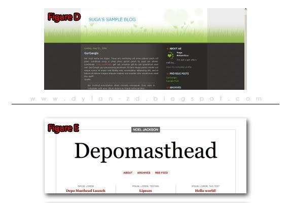
Figure D looks like the normal preset theme you get off your usual blog hosting site. It doesn't give you much freedom to edit your blog header. You just type in the words and the alignment is all done for you.
Simple but this can be deadly as it could ruin the whole design of your blog.
The header in Figure D looks unfinished, poorly executed and not planned properly. A wrong choice of font can be disastrous.
My suggestion is to get a blog template which lets you upload your own blog header image. What you need to do is to go to your own image editing software and create your own blog header using just fonts. Play around with the sizes, colours, font type and alignment. Your header does not only need to be in one single straight line.
Sometimes, if you choose the correct font type such as in Figure E, it will do all the work for you. The font looks more professional and the size and alignment is just right, giving it the 'kick'. Even though it is just text but it manages to give you that strong feeling.
2.4 BLENDING YOUR HEADER WITH THE BACKGROUND
One additional thing to take note of is, if you want your blog header to look at much better. Try blending your header with your background or your content area.

The aim here is to create a border-less header.
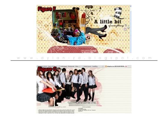
In the two examples above, both headers does not seem to have an edge. This can be achieved by using a transparent background while editing your header.
With this kind of header design, it doesn't hurt your readers eyes with sharp and pointy edges. However, it might take some time to design one of these headers to match with your blog template as some blog templates might need some further tweaking in the coding area.
Then again, do try to use this method while creating your blog header. It works for almost all blog header designs.
2.5 THE VERDICT
Get rid of rectangular floating headers. Especially those which has sharp edges.
Over-sized headers can be a bad thing, unless you know what you are doing.
Text headers can be simple but it does delivers if executed properly.
Blend your header with your background.
2.6 DOES THIS HELP YOU?
I have completed another set of blogging tips in hopes that it could help you all out just a little bit in understanding what design works and what doesn't.
There are a lot more header designs out there which I have not touched on. If you have any queries, do drop me a comment and I'll try my best to help you out.
Of course, everything here is based on my own perspective and point of view. My opinions might be different from yours.
If you think this blog post is really useful, help me Share this post on Facebook and also Tweet it on Twitter. Help me help others.
More blogging tips coming soon!